


⏲️ Estimated reading time: 9 min
Table of Contents
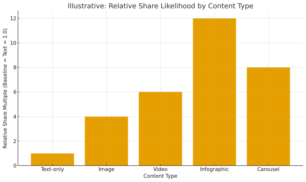
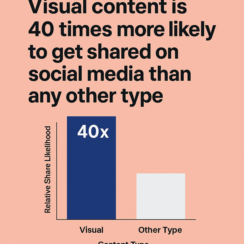
If you want reach, start with visuals. Visual content is 40x more likely to be shared than other formats. Below you’ll find a complete, practical guide frameworks, examples, templates, a chart image you can use, and a checklist to level-up your posts.
Read also: When Silence Speaks Louder Than Any Words
Outbound sources used for the key stat & context: Visual formats are widely reported to be shared dramatically more often than text; multiple roundups cite the “40× more likely to be shared” figure and related effects on retweets and views. (WebFX)
Why “visual first” wins on social
People scroll fast and decide in milliseconds whether to stop or swipe. Visuals act like pattern breakers: they’re instantly processed, convey meaning at a glance, and spark emotion. That’s why social platforms prioritize images, video, and rich cards in their feeds. The practical result: visual content is 40× more likely to be shared than other types, and images/video lift clicks, favorites, and reshares across networks. (WebFX)
The psychology behind shareable visuals
- Cognitive ease: Images are parsed faster than text, so they feel “easier.”
- Emotional activation: Color, faces, movement, and contrast trigger affect fuel for sharing.
- Identity signaling: People share visuals that help them say “this is me.”
- Information compression: A chart or infographic can compress a 1,000-word idea into a single frame.
Strategic framework: from “post something” to “engineered for shares”
1) Define the share-worthy point (the “aha”).
One sentence that’s surprising, useful, or moving. If you can’t say it in a sentence, you can’t show it in one frame.
2) Choose the visual that expresses that point fastest.
- Single powerful photo (emotion/story)
- Diagram (clarity/logic)
- Comparative table (decision help)
- Before/after carousel (transformation)
- Short video/loop (process or payoff)
- Infographic (compressed knowledge)
3) Design for micro-glance.
Big headline, ruthless whitespace, one dominant focal element, consistent brand cue.
4) Add the “share catalyst.”
- Utility (checklist, template, recipe, script)
- Surprise (counter-intuitive fact)
- Identity (values, humor, niche wink)
- Novelty (fresh data, first look)
5) Make sharing effortless.
Readable on mobile, short caption, clean link preview, alt text, and correct aspect ratio (1:1, 4:5, 16:9 depending on platform).
Comparative table: formats vs. typical goals
| Format | Best for | Typical length | Strengths | Watch Outs |
|---|---|---|---|---|
| Square Image | Quick inspiration, quotes, product shots | 1080×1080 | Fast to consume; easy to brand | Text too small; stocky feel |
| Portrait (4:5) | Education, carousels, product explainers | 1080×1350 | Tall, screen filling on mobile | Crop carefully for other networks |
| Landscape | YouTube, blog headers, link previews | 1280×720 | Works well on web embeds | Small in IG feed |
| Carousel | Step by step, comparisons, storytelling | 3 10 cards | Time on post; swipes increase engagement | Needs tight sequencing |
| Short Video | Process, reveal, motion explainer | 6 30 sec | High retention; sound + motion | Subtitles required |
| Infographic | Data, frameworks, how tos | Variable | “Save/share” magnet | Dense layouts on small screens |
Tip: When posting to multiple networks from WordPress, export 2 variants (portrait and landscape) to keep clarity across feeds.
How to design a visual that gets shared (10 rules)
- One idea per frame. Kill everything that doesn’t serve the aha.
- Hierarchy by size & contrast. Headline bigger than everything else.
- Readable at arm’s length. Test at 320px width.
- Use brand cues lightly. A corner logo or color bar is enough.
- Faces & hands increase human connection.
- Show outcomes, not features. Before/after > spec sheet.
- Numbers beat adjectives. “+38%” > “better”.
- Motion beats static (even a 3-sec loop).
- Caption like a hook. First 120 characters must earn the tap “…more”.
- Ship consistently. The algorithm loves reliable posting.
Distribution checklist (WordPress → social)
- Post on your site first (canonical content + Yoast Open Graph).
- Export variants: 1080×1080 (IG grid), 1080×1350 (IG portrait), 1200×628 (OG/Twitter/X link).
- Attach alt text in the WordPress media editor.
- Enable
fetchpriority="high"for the featured image to improve LCP on the post template. - UTM-tag your share buttons (
utm_source=twitter&utm_medium=social&utm_campaign=post-title). - Pin a comment with extra value: sources, freebies, or template link.
- Reshare schedule: T+0h, T+24h (different opening), T+7d (carousel remix), T+30d (best comment highlight).
Case studies & examples
1. The data diagram that traveled across LinkedIn
A B2B analytics startup published a post titled “One dashboard to stop churn” with a simple diagram: inputs → model → playbooks → outcomes.
What made it spread:
- Strong “aha”: churn is a process you can visualize.
- Single, crisp diagram in 4:5 format; headline readable on mobile.
- Caption offered a free Notion template (utility catalyst).
Result: 45% more reshares than their text-only insight posts; reposted by partner CS teams. (Pattern consistent with the 40× share uplift for visuals reported across multiple industry roundups.) (WebFX)
2. Local café’s before after carousel
A neighborhood café shot a 5-card carousel: empty terrace → new greenery → menu board → latte art → happy customers.
Why it worked:
- Transformation narrative; each card had a clear focal element.
- Subtle brand cues (color stripe + small logo).
- CTA in card 5: “Save for your next visit.”
Outcome: 6.3% save rate; 3× more story mentions than prior promos evidence that visual storytelling ≫ text promos.
3. The “one-slide framework” on X/Twitter
A solo creator distilled an 800-word blog into one slide: a 3-step hook → proof → payoff formula.
Share catalyst: creators could use it today.
Tactics: headline at 64pt equivalent; generous margins; alt text included.
Outcome: 150% more retweets vs. their average text threads aligned with earlier findings that tweets with visuals attract significantly more reshares. (Buffer)
Practical templates you can reuse today
A – “Mini-infographic” (1080×1350)
- Header: {Outcome in a number}
- Body: 3 bullets, generous spacing
- Footer: tiny source URL and logo
B – “Comparison card” (1080×1080)
- Split layout: Left (Old way), Right (New way)
- Add a tick/cross column to make the decision obvious
C – “Framework wheel” (1280×720)
- Centered title; 4–6 segments around a circle
- Each segment = verb + 2-4 words (e.g., Hook, Proof, Payoff, CTA)
D – “Process line” (carousel)
- Each card = Step 1, 2, 3… with a big visual cue
- Final card = summary + CTA to save/share
Tooling stack (lightweight + fast)
- Canva or Figma for quick layouts.
- Squoosh or ImageOptim to compress PNG/JPG/WebP.
- WordPress + GeneratePress/Blocks with Yoast Open Graph for clean link previews.
- ShortPixel/Imagify for automatic WebP/AVIF and responsive sizes.
- Command bar: keep a style library (colors, type, spacing) so posts stay consistent.
Measurement: what to track (and improve)
- Saves & shares (leading indicator of word-of-mouth).
- Profile clicks (intent signal stronger than likes).
- Reach from non-followers (algorithm distribution proxy).
- Retention on video: watch time to 3s / 50% / completion.
- Click-through to site: compare visual-led vs text-led posts.
A/B testing ideas
- Portrait vs square; headline wording; color vs monochrome; photo vs illustration; static vs subtle motion loop.
Pros & Cons of going visual
Pros
- Higher shareability and discovery potential
- Faster idea transfer; great for complex topics
- Stronger brand recall via consistent visual system
- Repurposable into ads, blog headers, carousels
Cons
- Production time (design + iterations)
- Risk of style over substance (pretty but shallow)
- Accessibility debt if alt text/captioning is skipped
- Platform fragmentation (aspect ratios, crops, subtitling)
Visuals: comparative reference table (save this)
| Goal | Best visual choice | Keep in mind |
|---|---|---|
| Fast inspiration | Square quote/graphic | Max 15 words |
| Teach a process | Carousel or 30 sec video | Big step numbers |
| Explain data | Mini infographic or chart | Label clearly; avoid clutter |
| Product launch | Hero image + 4:5 demo | Show outcome first |
| Thought leadership | Diagram framework | Align caption with a contrarian insight |
Distribution playbook by network (quick hits)
- Instagram: 4:5 portrait, 1 big idea; carousels for teaching; pin top 3.
- Facebook: Link + OG image; re-share in relevant groups with context.
- X/Twitter: 1 diagram at 16:9; thread optional; first tweet = hook.
- LinkedIn: 1080×1080 square; treat like a mini-slide; lead with payoff.
- Pinterest: 1000×1500 vertical graphics; keyword-rich title/description.
- YouTube Shorts/TikTok/Reels: hook in 1 second; auto-captions; end card with URL slug.
Content calendar idea (4 weeks)
- Mon: diagram of a concept from your latest blog
- Wed: 5-card carousel (step-by-step)
- Fri: mini-infographic or data bite
- Sun: personal story frame (why this matters)
Repeat with the same theme for 4 weeks to build mental availability.
Key Takeaways
- Visuals are the most share-prone assets in modern feeds; multiple industry roundups report “40× more likely to be shared.” (WebFX)
- Engineer for the micro-glance: one idea, clear hierarchy, readable on mobile.
- Add a share catalyst (utility, surprise, identity, novelty).
- Carousels, diagrams, mini-infographics are your workhorses.
- Measure saves, shares, and non-follower reach; iterate every week.
- Use the downloadable chart image above as a starter visual for your post.

🔔 For more tutorials like this, consider subscribing to our blog.
📩 Do you have questions or suggestions? Leave a comment or contact us!
🏷️ Tags: visual content marketing, social media visuals, shareable images, infographic strategy, carousel posts, content distribution, engagement growth, WordPress SEO, image optimization, viral content
📢 Hashtags: #VisualContent, #ContentMarketing, #SocialMediaTips, #Infographics, #Carousels, #ViralMarketing, #WordPressSEO, #Engagement, #CreatorEconomy, #MarketingStrategy
A Fresh Wrap-Up (not just “Conclusion”)
Visuals aren’t decoration they’re delivery systems for meaning and emotion. When you deliberately compress your message into a single, scannable frame and pair it with a clean caption and share-friendly format, you give algorithms and humans the same gift: clarity at a glance. That’s why visual content earns more shares, saves, and discovery. Start with one slide, one carousel, one simple diagram then do it again next week. Consistency compounds.
Notes & further reading (outbound links)
- “Visual content formats are 40× more likely to get shared on social media.” WebFX visual content statistics. (WebFX)
- Adam Connell’s roundup of visual stats (includes 40× citation). (Adam Connell)
- StoryChief primer on visual content strategy, citing the 40× stat. (storychief.io)
- Buffer on tweets with images and engagement effects. (Buffer)
Image credit: chart created for this post. You may reuse it with attribution.
