


⏲️ Estimated reading time: 3 min
Table of Contents
⭐ CSS Tooltip + Slide-Up Animation: The Complete Guide to Building a Premium UI Element. CSS tooltips are small but powerful UI elements that help users access information without cluttering a page. This guide explains step by step how to build a premium tooltip with a slide-up animation, smooth transitions, clean design, and perfect WordPress integration.
Tooltips
Tooltips are everywhere in modern web interfaces. They deliver extra information quickly, without overwhelming the user or breaking the layout.
A well-made tooltip blends in visually, feels responsive, and adds a polished layer to any design.
In this guide, you’ll learn everything from scratch:
- what a CSS tooltip is
- how to build the HTML structure
- how to style it professionally
- how to add a smooth slide-up animation
- how to customize it for WordPress websites
You’ll end up with a premium, modern, fully-animated tooltip that works flawlessly on desktop and mobile.
What is a CSS Tooltip?
A CSS tooltip is a tiny floating label that appears when users hover over an element (desktop) or tap it (mobile). It’s used for:
- short explanations
- clarifying icons or buttons
- definitions or extra details
- minimalist UI enhancements
- reducing visual noise
Best of all, it requires no JavaScript it’s lightweight, fast, and browser-friendly.
HTML Structure for the Tooltip
Here is the clean, minimal structure:
<span class="tooltip">Info
    <span class="tooltip-text">This is a slide-up tooltip!</span>
</span>
The parent .tooltip hosts the trigger, and .tooltip-text is the floating box revealed on hover.
Premium CSS Tooltip + Slide-Up Animation
Below is the complete, elegant, optimized CSS:
.tooltip {
  position: relative;
  display: inline-block;
  cursor: pointer;
  font-weight: 600;
  padding: 4px 8px;
  background: #f2f2f2;
  border-radius: 6px;
  transition: background .3s ease;
}

.tooltip:hover {
  background: #e4e4e4;
}

.tooltip .tooltip-text {
  position: absolute;
  bottom: 140%;
  left: 50%;
  transform: translateX(-50%) translateY(10px);
  padding: 8px 12px;
  background: #000;
  color: #fff;
  font-size: 13px;
  border-radius: 6px;
  white-space: nowrap;
  opacity: 0;
  visibility: hidden;
  transition: all .35s cubic-bezier(.175, .885, .32, 1.275);
  box-shadow: 0 8px 25px rgba(0,0,0,0.25);
}

.tooltip:hover .tooltip-text {
  opacity: 1;
  visibility: visible;
  transform: translateX(-50%) translateY(-5px); /* SLIDE-UP */
}

.tooltip .tooltip-text::after {
  content: "";
  position: absolute;
  top: 100%;
  left: 50%;
  transform: translateX(-50%);
  border-width: 6px;
  border-style: solid;
  border-color: #000 transparent transparent transparent;
}
This version includes:
✔ elastic slide-up animation
✔ smooth fade + movement
✔ soft shadow
✔ modern rounded corners
✔ full responsiveness
✔ no JavaScript
How the Slide-Up Effect Works
The trick is in the transform property:
Initial state:
transform: translateX(-50%) translateY(10px);
opacity: 0;
On hover:
transform: translateX(-50%) translateY(-5px);
opacity: 1;
This small vertical shift, combined with an easing curve like:
cubic-bezier(.175, .885, .32, 1.275)
creates a smooth, premium slide-up motion.
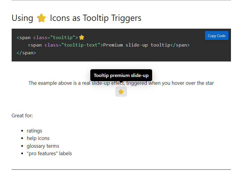
Using ⭐ Icons as Tooltip Triggers
<span class="tooltip">⭐
    <span class="tooltip-text">Premium slide-up tooltip</span>
</span>
Great for:
- ratings
- help icons
- glossary terms
- “pro features” labels
Adding the Tooltip to WordPress
You can use three extremely simple methods:
1. Add CSS via Appearance → Customize → Additional CSS
– Best for website-wide tooltip usage.
2. Insert HTML + CSS inside a Gutenberg Custom HTML block
– Perfect for single blog posts.
3. Add the CSS through the Code Snippets plugin
– Best for long-term flexibility.
Smart Delay for a Softer Feel
.tooltip .tooltip-text {
  transition-delay: .15s;
}
Changing Tooltip Colors
Gradient background:
background: linear-gradient(135deg, #ff8a00, #e52e71);
Semi-transparent version:
background: rgba(0,0,0,0.75);
UX Best Practices for Tooltips
- Keep messages short
- Use them sparingly
- Ensure readable contrast
- Test tooltip behavior on mobile
- Avoid overlapping tooltips
A good tooltip should improve the interface not overwhelm it.
Slide-Up + Fade Hybrid Effect
Fade is natural with opacity transitions:
opacity: 0 → 1
Combined with vertical shift, this produces a premium motion effect.
Pros and Cons of Slide-Up Tooltips
| Pros | Cons |
|---|---|
| Smooth modern animation | Can distract if overused |
| Lightweight (no JS) | Needs mobile testing |
| Highly visual and elegant | Some themes may override CSS |
| Works in all modern browsers | Needs small adjustments for RTL |
Simple Tooltip vs Slide-Up Tooltip
| Tooltip Type | Complexity | UX Quality | Animation | Best Use Case |
|---|---|---|---|---|
| Simple Tooltip | Low | Good | Minimal | Corporate websites |
| Slide-Up Tooltip | Medium | Excellent | Premium | Blogs, modern UI, apps |
Key Ideas
The slide-up tooltip is a powerful yet lightweight UI component that enhances user interaction without relying on JavaScript. With modern CSS easing and clean styling, it becomes a premium element suitable for stylish WordPress websites and professional interfaces. Flexible, elegant, responsive.
Premium slide-up tooltip
Now that you understand exactly how to build a ⭐ Premium slide-up tooltip premium CSS tooltip with a slide-up effect, you can apply it anywhere on your site to enhance clarity and improve your UI. Feel free to experiment with colors, shadows, and easing curves to match your brand.
Frequently Asked Questions (FAQ)
How does the tooltip activate on mobile?
It appears on tap similar to hover.
Do I need JavaScript for this animation?
No. The effect is entirely CSS-based.
Can I animate sideways instead of upward?
Yes. Replace translateY with translateX.
Is it compatible with all WordPress themes?
Yes, but some themes may override colors or padding.
Disclaimer & Source Hygiene
This guide is intended for educational and practical use. Always test CSS in a safe environment before applying it to a live site. Visual rendering may vary slightly depending on your theme, browser, or active plugins. All information is verified, but adjustments may be needed per project.
You may also be interested in: WPZone Neon Clock – Digital Clock for WordPress
🔔 For more tutorials like this, consider subscribing to our blog.
📩 Do you have questions or suggestions? Leave a comment or contact us!
🏷️ Tags: css tooltip, slide-up effect, web design tutorial, wordpress css, front-end animations, ui components, ux tricks, html css guide, premium tooltip, animation techniques
📢 Hashtags: #CSS #Tooltip #WebDesign #SlideUp #FrontEnd #WordPressTips #UIUX #Animation #CodeSnippets #WebDevelopment
