⏲️ Estimated reading time: 4 min
Effective Color Combinations in Marketing: What They Mean and Why They Matter
Effective Color combinations in marketing shape how consumers perceive your brand. More than just visual appeal, colors serve as emotional and psychological triggers that influence buying decisions, build trust, and convey brand values.
In today’s competitive marketplace, choosing the right color scheme isn’t just a design choice it’s a strategic move. For this reason, understanding how specific color combinations affect consumer perception is essential.
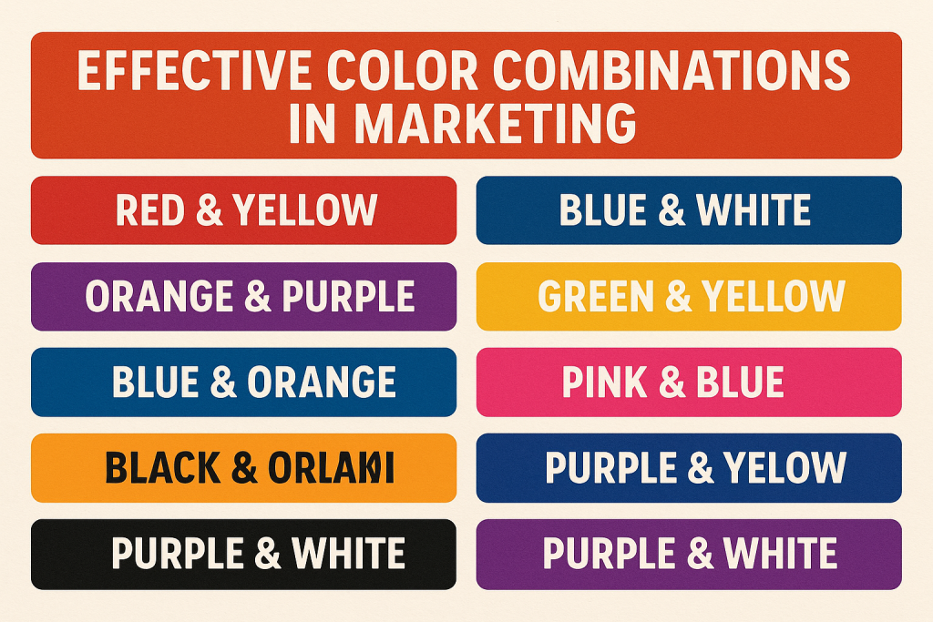
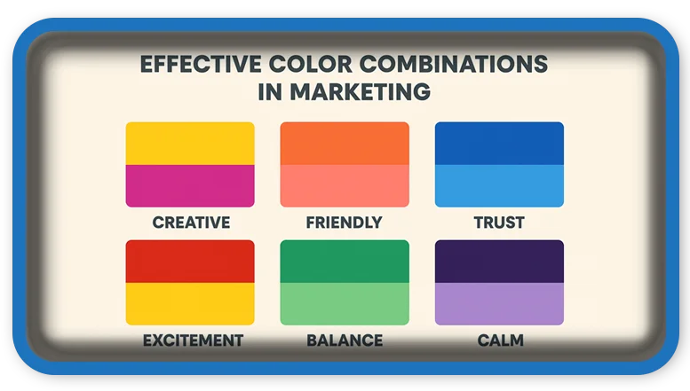
Below, we explore ten powerful color pairings and explain how each one supports different marketing goals.
1. Blue and White
- Meaning: Trust, reliability, professionalism
- Used by: Finance, tech, and healthcare brands
- Examples: Facebook, Twitter, PayPal
- Why it works: Blue conveys stability, while white adds clarity. Therefore, this duo builds credibility and confidence, especially in data-driven industries.
2. Red and Yellow
- Meaning: Energy, urgency, friendliness
- Used by: Food and fast-service brands
- Examples: McDonald’s, Coca-Cola, Shell
- Why it works: Red attracts attention and signals action. Yellow evokes joy and comfort. Together, they encourage quick decisions perfect for impulse purchases.
3. Green and Brown
- Meaning: Nature, health, authenticity
- Used by: Organic, eco-conscious, and wellness brands
- Examples: Whole Foods, Tropicana, Starbucks
- Why it works: Green represents freshness and growth. Brown adds warmth and earthiness. As a result, this combination appeals to environmentally mindful consumers.
4. Black and Gold
- Meaning: Prestige, elegance, exclusivity
- Used by: Luxury goods and premium services
- Examples: Chanel, Rolex, Lamborghini
- Why it works: Black delivers strength and boldness. Gold suggests success and affluence. Consequently, this pairing positions brands as elite and aspirational.
5. Purple and Gold
- Meaning: Creativity, royalty, premium value
- Used by: High-end lifestyle and celebratory brands
- Examples: Hallmark, Cadbury
- Why it works: Purple stimulates imagination and uniqueness. Gold highlights value and sophistication. Therefore, it works well for brands offering rich, memorable experiences.
6. Orange and Gray
- Meaning: Innovation, energy, balance
- Used by: Startups and creative industries
- Examples: Harley-Davidson, Fanta, SoundCloud
- Why it works: Orange energizes and inspires action. Gray keeps things grounded and modern. This balance allows brands to appear bold yet trustworthy.
7. Turquoise and Coral
- Meaning: Approachability, uniqueness, fun
- Used by: Travel, fashion, and home décor brands
- Examples: Airbnb, Tiffany & Co.
- Why it works: Turquoise relaxes and refreshes, while coral adds excitement. In effect, they produce a lively and friendly vibe that appeals to a broad audience.
8. Navy and Gold
- Meaning: Authority, trust, refinement
- Used by: Financial, educational, and corporate brands
- Examples: American Express, Navy Federal
- Why it works: Navy creates seriousness and depth. Gold offers prestige. Thus, the blend communicates strength and sophistication.
9. Pink and Gray
- Meaning: Femininity, softness, modern elegance
- Used by: Beauty, fashion, and lifestyle brands
- Examples: Victoria’s Secret, Glossier
- Why it works: Pink adds charm and warmth. Gray neutralizes and balances the design. For this reason, the combination feels stylish yet calm.
10. Black and White
- Meaning: Simplicity, contrast, timelessness
- Used by: Minimalist and luxury brands
- Examples: Apple, Gucci, Nike
- Why it works: Black emphasizes form and function. White introduces space and clarity. Ultimately, this high-contrast combo stands the test of time.

How to Choose the Right Effective Color Combo for Your Brand
When building your brand palette, follow these steps:
- Start with your audience: Different groups respond to colors in unique ways. Gender, age, and culture all play a role.
- Define your message: Choose colors that align with your brand’s personality and values.
- Research competitors: You don’t want to look too similar, but understanding industry standards is crucial.
- Test and adapt: Use A/B testing to discover which color schemes perform better across platforms.
In conclusion, color strategy isn’t guesswork it’s a branding tool that, when used correctly, drives emotional engagement and customer loyalty.
Final Thoughts
Every color combination tells a story. By aligning your brand’s visual identity with the right emotional triggers, you boost recognition, enhance trust, and ultimately drive conversions. Whether you’re launching a new product or rebranding, always remember: color speaks louder than words.
📩 Do you have questions or suggestions? Leave a comment or contact us!
🏷️ Tags: color psychology, marketing strategy, brand design, visual identity, brand colors, emotional marketing, graphic design, advertising tips, color combinations, consumer behavior
Only logged-in users can submit reports.
Discover more from HelpZone
Subscribe to get the latest posts sent to your email.

