⏲️ Estimated reading time: 7 min
Analog Clock with World Time in HTML, CSS & JavaScript. Discover how to create a beautiful analog clock with dynamic hands, digital display, and time zone selection using pure HTML, CSS, and JavaScript. This guide includes full code and explanations perfect for beginner to intermediate front-end developers.
🌍 Build a Multi-Timezone Analog Clock Using HTML, CSS, and JavaScript
In this tutorial, you’ll learn how to build an elegant analog clock that not only shows the current time but also allows switching between different cities like Tokyo, New York, Sydney, and more all using HTML, CSS (with Tailwind), and JavaScript.
The final result is a smooth, responsive, and interactive clock with both analog hands and a digital time display.
🛠️ Features of the Clock
- Functional analog design with hour, minute, and second hands
- Digital time display with city label
- Buttons for 9 global cities and local time
- Smooth transitions for hand movements
- Active button highlighting with Tailwind styling
🔧 Full HTML, CSS, and JS Code
Below is the complete code to create this responsive and animated analog clock with world time functionality.
📁 HTML Structure
<!DOCTYPE html>
<html lang="en">
<head>
  <meta charset="UTF-8" />
  <meta name="viewport" content="width=device-width, initial-scale=1.0"/>
  <title>Ceas Analogic</title>
  <script src="https://cdn.tailwindcss.com"></script>
  <script>
    tailwind.config = {
      theme: {
        extend: {
          fontFamily: {
            inter: ['Inter', 'sans-serif'],
          },
        },
      },
    };
  </script>
  <link href="https://fonts.googleapis.com/css2?family=Inter:wght@400;600&display=swap" rel="stylesheet" />
  <style>
    body {
      font-family: 'Inter', sans-serif;
      background-color: #f0f0f0;
      display: flex;
      justify-content: center;
      align-items: center;
      min-height: 100vh;
      margin: 0;
      overflow: hidden;
    }

    .clock-container {
      position: relative;
      width: 300px;
      height: 300px;
      background-color: white;
      border-radius: 20px;
      border: 8px solid black;
      box-shadow: 0 0 20px rgba(0, 0, 0, 0.5);
      display: flex;
      justify-content: center;
      align-items: center;
      max-width: 90vw;
      max-height: 90vw;
    }

    .number {
      position: absolute;
      font-size: 1.5rem;
      font-weight: 600;
      color: #333;
      display: flex;
      justify-content: center;
      align-items: center;
      width: 30px;
      height: 30px;
      transform: translate(-50%, -50%);
      text-shadow: 1px 1px 2px orange;
    }

    .number.n1  { transform: translate(60px, -105px); }
    .number.n2  { transform: translate(105px, -60px); }
    .number.n3  { transform: translate(120px, 0px); }
    .number.n4  { transform: translate(105px, 60px); }
    .number.n5  { transform: translate(60px, 105px); }
    .number.n6  { transform: translate(0px, 120px); }
    .number.n7  { transform: translate(-60px, 105px); }
    .number.n8  { transform: translate(-105px, 60px); }
    .number.n9  { transform: translate(-120px, 0px); }
    .number.n10 { transform: translate(-105px, -60px); }
    .number.n11 { transform: translate(-60px, -105px); }
    .number.n12 { transform: translate(0px, -120px); }

    .hand {
      position: absolute;
      background-color: black;
      border-radius: 5px;
      transform-origin: bottom center;
      z-index: 10;
      transform: rotate(0deg);
    }

    .hour-hand {
      width: 8px;
      height: 80px;
      top: calc(50% - 80px);
      left: calc(50% - 4px);
    }

    .minute-hand {
      width: 6px;
      height: 120px;
      top: calc(50% - 120px);
      left: calc(50% - 3px);
    }

    .second-hand {
      width: 3px;
      height: 140px;
      top: calc(50% - 140px);
      left: calc(50% - 1.5px);
      background-color: orange;
    }

    .center-dot {
      width: 16px;
      height: 16px;
      background-color: black;
      border-radius: 50%;
      position: absolute;
      z-index: 20;
    }

    .animate {
      transition: transform 2s ease;
    }
  </style>
</head>
<body>
  <div class="clock-container">
    <div class="number n1">1</div>
    <div class="number n2">2</div>
    <div class="number n3">3</div>
    <div class="number n4">4</div>
    <div class="number n5">5</div>
    <div class="number n6">6</div>
    <div class="number n7">7</div>
    <div class="number n8">8</div>
    <div class="number n9">9</div>
    <div class="number n10">10</div>
    <div class="number n11">11</div>
    <div class="number n12">12</div>

    <div class="hand hour-hand" id="hourHand"></div>
    <div class="hand minute-hand" id="minuteHand"></div>
    <div class="hand second-hand" id="secondHand"></div>
    <div class="center-dot"></div>
  </div>

  <script>
    document.addEventListener('DOMContentLoaded', () => {
      const hourHand = document.getElementById('hourHand');
      const minuteHand = document.getElementById('minuteHand');
      const secondHand = document.getElementById('secondHand');

      const now = new Date();
      const seconds = now.getSeconds();
      const minutes = now.getMinutes();
      const hours = now.getHours();

      const secondDeg = (seconds / 60) * 360;
      const minuteDeg = (minutes / 60) * 360 + (seconds / 60) * 6;
      const hourDeg = (hours % 12) / 12 * 360 + (minutes / 60) * 30;

      // Animate second hand first
      secondHand.classList.add("animate");
      secondHand.style.transform = `rotate(${secondDeg}deg)`;

      setTimeout(() => {
        // Animate hour hand next
        hourHand.classList.add("animate");
        hourHand.style.transform = `rotate(${hourDeg}deg)`;

        setTimeout(() => {
          // Animate minute hand last
          minuteHand.classList.add("animate");
          minuteHand.style.transform = `rotate(${minuteDeg}deg)`;

          setTimeout(() => {
            // Remove animation class and start ticking normally
            hourHand.classList.remove("animate");
            minuteHand.classList.remove("animate");
            secondHand.classList.remove("animate");

            startClock();
          }, 2000); // after minute animation
        }, 2000); // after hour animation
      }, 200); // short delay before second animation

      function startClock() {
        setInterval(() => {
          const now = new Date();
          const seconds = now.getSeconds();
          const minutes = now.getMinutes();
          const hours = now.getHours();

          const secondDegrees = (seconds / 60) * 360;
          const minuteDegrees = (minutes / 60) * 360 + (seconds / 60) * 6;
          const hourDegrees = (hours % 12) / 12 * 360 + (minutes / 60) * 30;

          secondHand.style.transform = `rotate(${secondDegrees}deg)`;
          minuteHand.style.transform = `rotate(${minuteDegrees}deg)`;
          hourHand.style.transform = `rotate(${hourDegrees}deg)`;
        }, 1000);
      }
    });
  </script>
</body>
</html>
🎨 CSS (Inline)
The CSS styles are written directly in the <style> block in the <head> tag. Highlights:
.clock-containeris centered and styled as a circle with borders and shadows..numberclass positions numbers from 1 to 12 usingtransform..handclasses define size, color, and animation for hour, minute, and second hands..activeclass is used for currently selected city/timezone.
Example:
.hand {
  position: absolute;
  background-color: black;
  border-radius: 5px;
  transform-origin: bottom center;
  z-index: 10;
}
.hour-hand {
  height: 80px;
  ...
}
🧠 JavaScript Logic
The JavaScript is responsible for:
- Calculating time for selected cities
- Rotating the clock hands smoothly
- Updating the digital display every second
- Switching between time zones with button clicks
Time Zone Handling Example:
const zones = {
  local: { offset: null, label: "Bruxelles" },
  tokyo: { offset: 9, label: "Tokyo" },
  newyork: { offset: -4, label: "New York" },
  ...
};
The clock updates every second using setInterval(updateClock, 1000), with rotate(deg) logic for each hand.
⏰ Why This Clock Is Special
This analog clock isn’t just static it dynamically switches time zones using JavaScript offsets. That means you can track time across multiple global cities in real-time. Great for travelers, developers, and dashboard designs.
🪄 Tech Stack Used:
- HTML5 – Markup for structure
- Tailwind CSS – Utility-first styling
- Vanilla JavaScript – Logic and interactivity
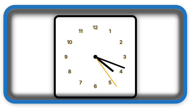
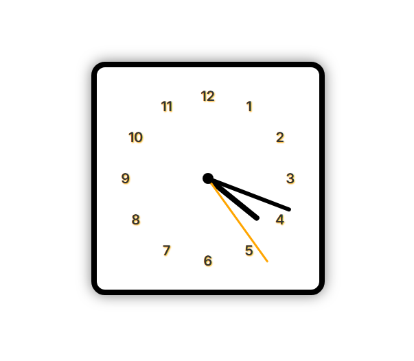
📸 Screenshot Preview
You can use the code in any modern browser, embed it in your WordPress site via a custom HTML block, or enhance it further by adding SVG graphics, themes, or sound ticks!
🚀 How to Use It in WordPress
To integrate this clock in a WordPress site:
- Use the HTML Block in Gutenberg editor.
- Paste the full code inside a
<html>block or custom HTML plugin/widget. - Make sure Tailwind CSS loads correctly (you may need to enqueue it via
functions.phpor CDN in the<head>). - Optionally, add styling via your theme CSS.
🧪 Expand It Further
Want more features? Consider:
- Adding AM/PM toggle
- Styling per city (change clock color by location)
- Integrating weather API alongside time
- Adding animation when switching cities
🔔 For more tutorials like this, consider subscribing to our blog.
📩 Do you have questions or suggestions? Leave a comment or contact us!
🏷️ Tags: analog clock, JavaScript clock, world clock HTML, time zones, Tailwind CSS, front-end tutorial, HTML projects, CSS animation, JavaScript beginner, WordPress HTML embed
📢 Hashtags: #AnalogClock #JavaScript #HTMLProjects #WorldClock #FrontendDev #CSSDesign #TailwindCSS #WebDesign #ClockWidget #WordPressIntegration
Final Thoughts
This analog clock project is a fun and practical exercise in front-end development. It combines clean design with real functionality. Whether you’re building a dashboard or a travel website, this interactive clock adds a professional and dynamic touch to your interface. Try it out and customize it for your needs!
Only logged-in users can submit reports.
Discover more from HelpZone
Subscribe to get the latest posts sent to your email.